CHEC Features: Increasing Visibility, Predictability, and Efficiency

Project type: Redesign of the web‑based interface used for creating and managing custom vehicle logic

Team: 5 developers, 3 product owners, 1 scrum master, 1 QA, 1 UX (me)

My role: Sole UX designer—owned discovery, interaction design, and design direction; collaborated on ideation and validation with the broader Agile team.

Executive Summary

The Features section of the CHEC tool lets users build, test, and customize logic that controls vehicle behavior. Over time, critical functionality became hidden behind contextual patterns, making it hard to find, remember, and reuse—especially for users who engage with the tool infrequently and have low digital proficiency.

Hypothesis

If commonly used controls are moved out of the contextual sidebar and into a persistent, always visible control bar, users will navigate tasks faster, reduce re learning, and rely less on support.

Legacy header behavior
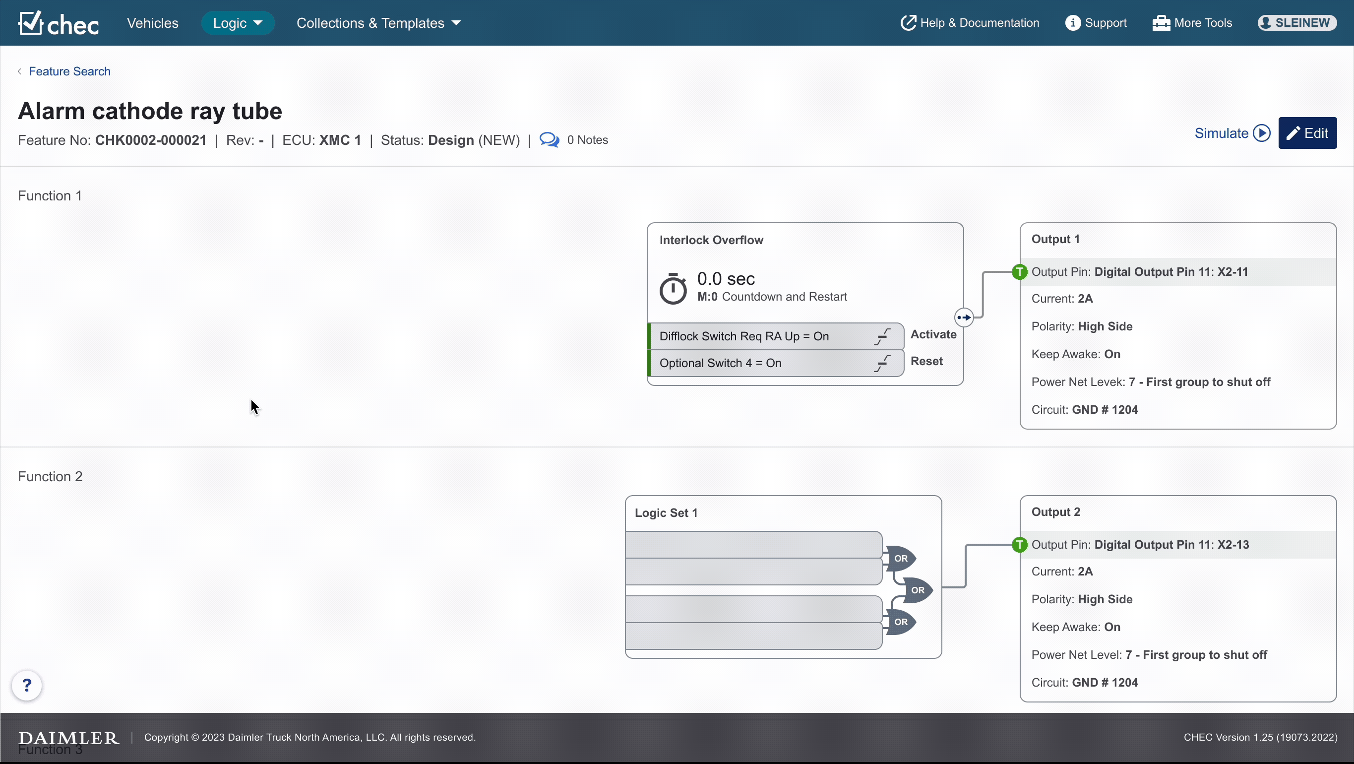
Updated header behavior

Background & Context

CHEC’s Features area was originally built eight years ago based on a prior Daimler Truck logic tool. New capabilities were added over time with minimal disruption to the existing layout, which led to hidden controls inside a right hand contextual panel that appeared only after selecting particular canvas elements.

Compounding factors

  • Users often go weeks or months between sessions.
  • Many have low comfort with web UIs and prefer predictable, visible patterns.
  • The page header appeared interactive on hover but was text-only, didn’t read as interactive, and wasn’t sticky—so it scrolled away and hid key entry points.

The Problem (User Centric)

Critical functions were buried in non-discoverable locations. Users had to know which canvas element to select to reveal controls, or rely on training/support.

Top pain points from feedback and observation:

  • Lifecycle updates were hard to find and use.
  • Simulation controls were difficult to locate.
  • Editing affordances (“Add Function,” “Import Logic”) often fell below the fold.
  • Space constraints during editing—the Orphans column consumed valuable screen real estate even when empty.
  • Exiting Simulation was non-intuitive (exit placed inside a notification).
  • Version History was contextually available but hard to discover and understand.

Impact

  • Increased cognitive load, confusion, and relearning after time away.
  • Higher dependency on training and support channels.

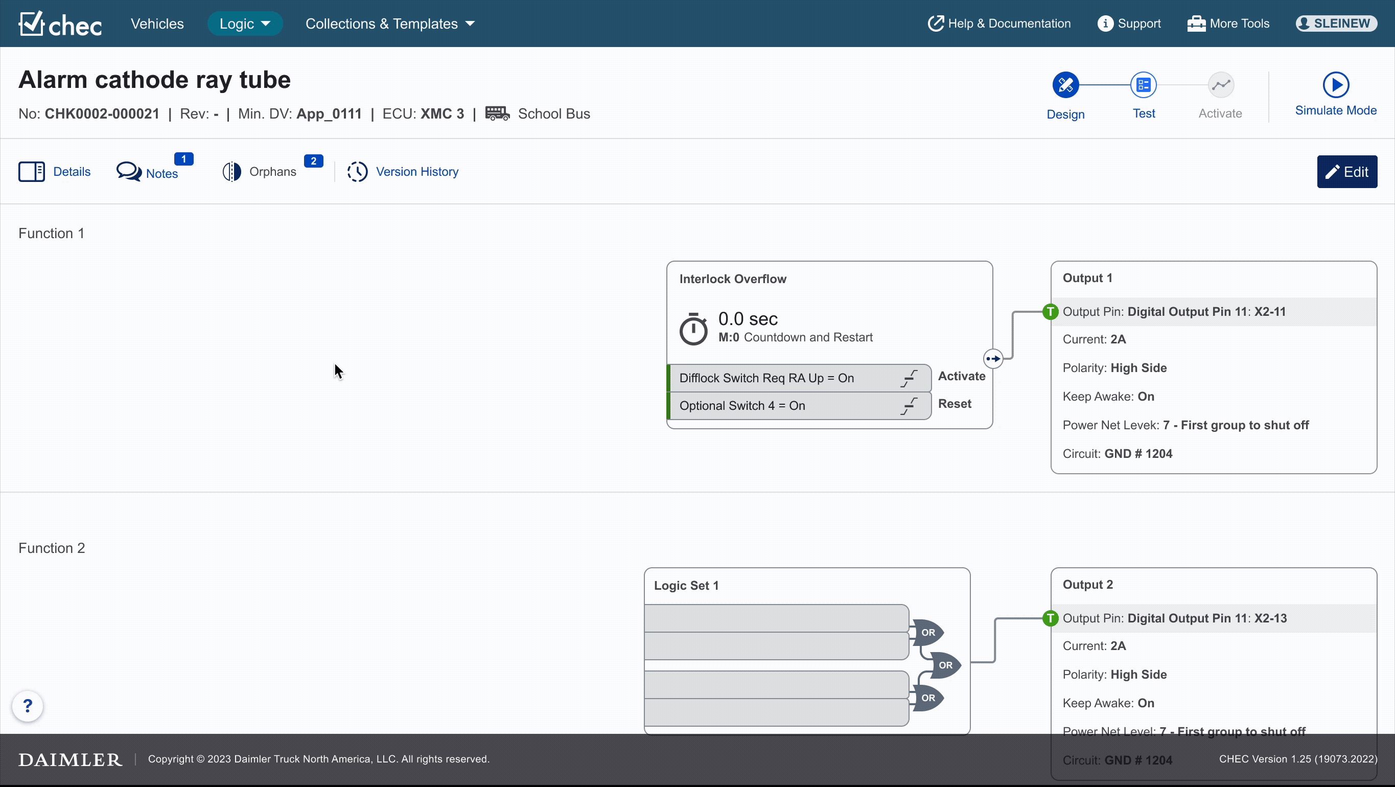
Example: Affordance Gaps in the Feature Header

The darkest blue regions illustrate where users are most likely to click, driven by stronger affordances and clearer visual hierarchy. The Feature Header, shown in the lightest blue, blends into the background and fails to signal interactivity, causing users to overlook it entirely. This contributes to recurring confusion about where important controls are located.

Users & Constraints

Primary users

  • Infrequent users (weeks/months between sessions)
  • Low digital proficiency
  • Prefer stable, persistent controls over novel patterns
  • Reluctant to explore hidden UI; rely on clear, visible affordances

Constraints

  • Must balance modernization with legacy user expectations
  • Some system behaviors (e.g., Version History availability) must remain context-dependent
  • Resource constraints across dev, training, and support for large-scale changes

Research & Insights

Discovery

  • Users overlooked text-only interactive areas in the header (no clear affordance).
  • Many functions were obstructed by dependency interactions (e.g., needing to select a parent element first).
  • The non-sticky header reduced access to key controls during scrolling.

Key insights

  • Make core functions visible at all times. Persistent placement reduces relearning.
  • Use clear, explicit affordances (buttons, icons, labels) rather than text-only/hover states.
  • Contextual content is helpful, but not when it hides critical functions by default.
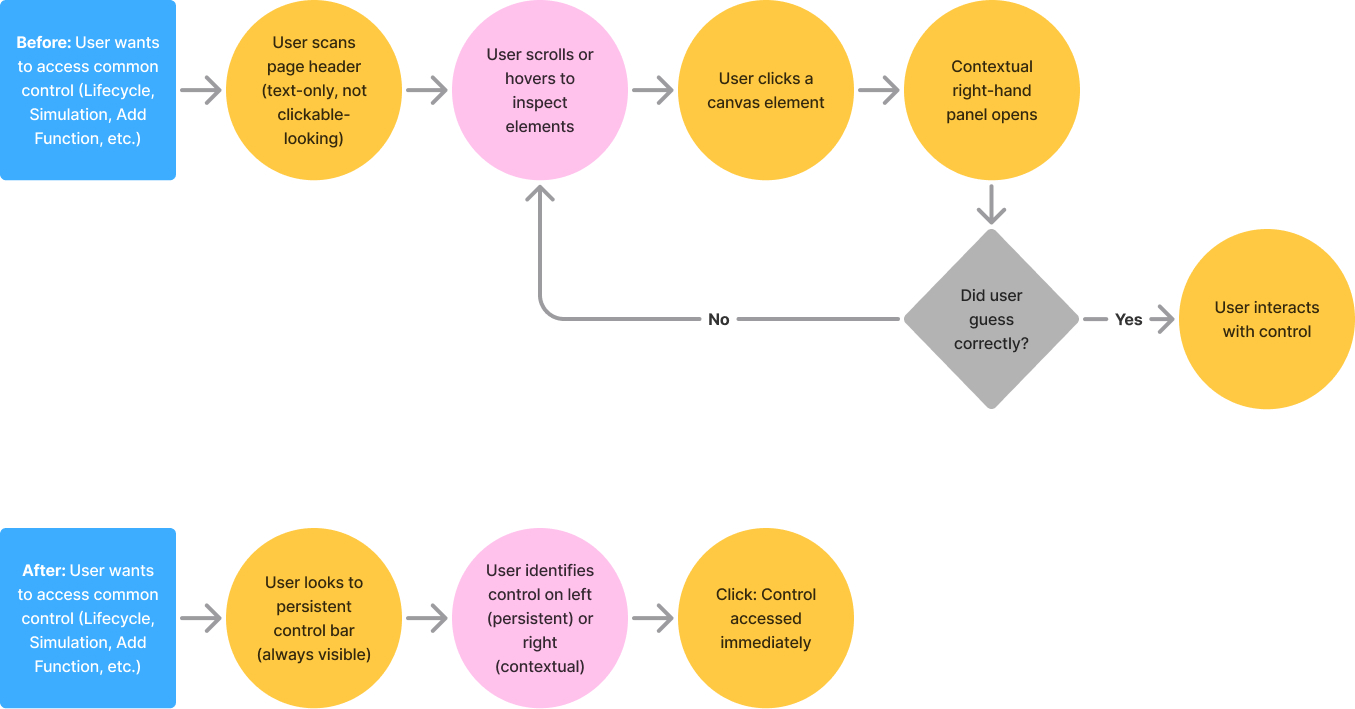
Legacy Lifecycle control discovery path
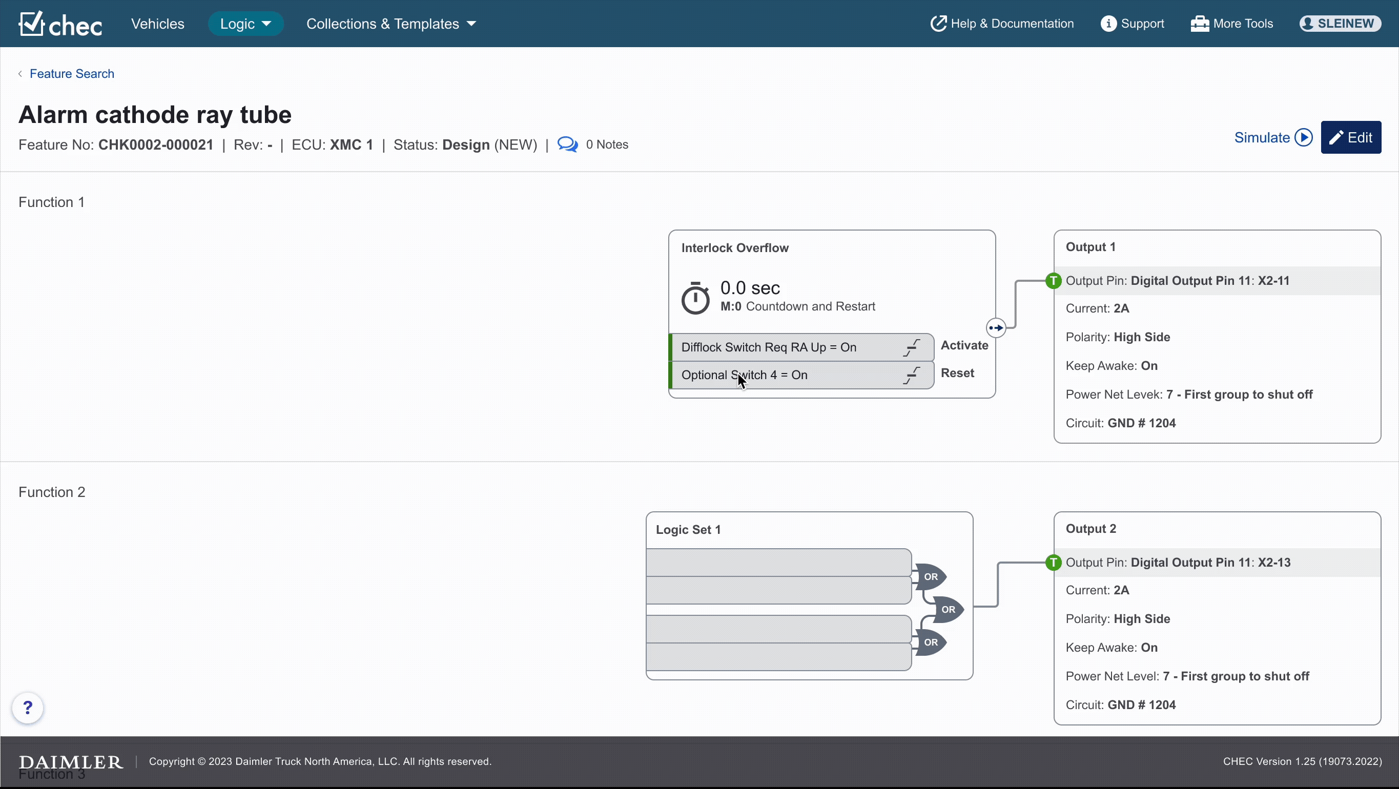
Updated Lifecycle control discovery path
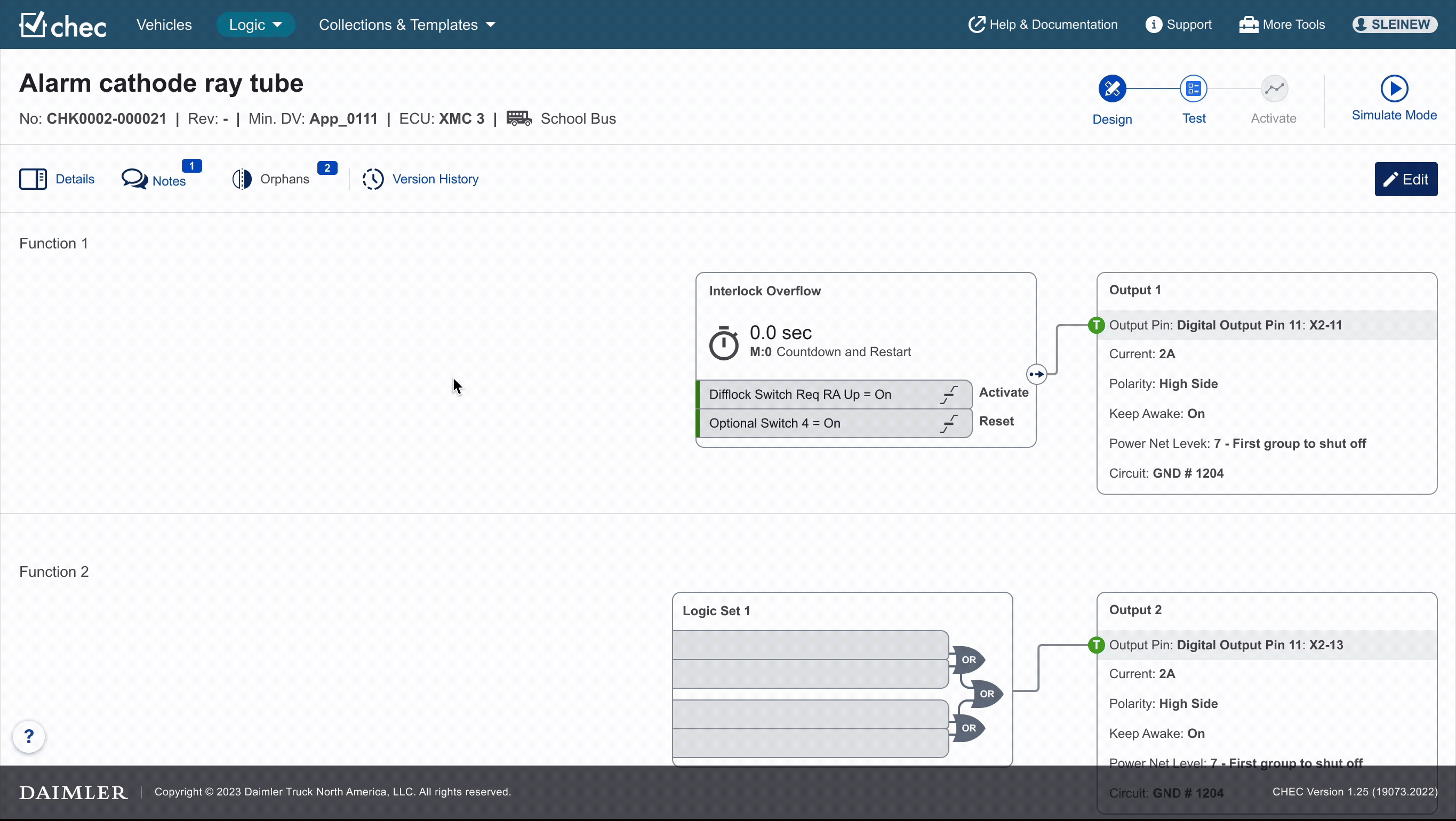
Hypothesis

Centralizing frequently used controls in a persistent, visible location is expected to reduce cognitive effort and streamline task completion, particularly for users returning after long intervals.

Design Approach

  1. Prioritize visibility & predictability: Keep essential controls in sight, always.
  2. Support both legacy and new users: Maintain familiar entry points while adding explicit buttons.
  3. Make the header & controls sticky: Prevent critical UI from scrolling away.
  4. Right-size context: Keep context-sensitive controls, but centralize them in a predictable control bar.
  5. Reclaim working space: De-emphasize rarely used panels (e.g., Orphans) to maximize canvas.

Solution

1) Persistent Page Head + Contextual Control Bar

Before:

  • Key entry points were in a text-only header that wasn’t sticky, and critical functions were hidden in a right sidebar requiring specific selection.

After:

  • Sticky page head remains visible during scroll.
  • New control bar below the header:
    • Left side: Persistent buttons for high-frequency actions (always visible).
    • Right side: Contextual controls that update based on the selected function.

Why this helps:

  • Reduces search and cognitive load.
  • Reinforces a single, predictable area for controls.
  • Helps users remember where to look after time away.
Reduction of Interaction Steps to Access Core Control

2) Dual Entry for Legacy Familiarity

Before:

  • The left portion of the header was clickable—but didn’t look interactive.

After:

  • Kept the legacy clickable area for experienced users.
  • Added a clear button that leads to the same area for new or unsure users.

Why this helps:

  • Preserves muscle memory for long-time users.
  • Adds explicit affordance for everyone else.

3) Reclaiming Space: Orphans as a Dismissible Panel

Before:

  • Orphans column always visible, taking <25% of the canvas—even when empty.

After:

  • Orphans moved into a dismissible panel that users open only when needed.

Why this helps:

  • Reduces visual clutter and maximizes canvas for active editing.
  • Aligns with feedback from experts who wanted more space.

4) Simulation, Lifecycle, and Exit Improvements

  • Lifecycle controls surfaced in the persistent/control bar location.
  • Simulation controls grouped predictably in the control bar context area.
  • Exit Simulation moved out of transient notification and into a stable, visible control.

Why this helps:

  • Eliminates “hunt” behavior for critical flows.
  • Gives users a clear path in and out of Simulation.

5) Version History: Visibility vs. System Constraints

What changed: A dedicated, easy-to-spot control for Version History.

What remains: It’s still available only when viewing, not when editing or simulating, due to system rules.

Mitigation: Microcopy or tooltip clarifying when/why Version History appears.

Copy example: “Version History is only available when viewing a Feature.”

Challenges

  • Change management & resourcing: The redesign required coordination across development, training, and support to update materials and workflows.
  • User comfort vs. modern patterns: Early explorations with floating/untethered controls preserved space but failed for this audience—too much movement and uncertainty for low-proficiency users. Anchored, predictable controls tested better.
  • System-driven constraints: Some behaviors (e.g., Version History availability) are contextual by necessity, requiring UX cues rather than structural change.

What I Learned

  • Don’t ship “clever” solutions at the expense of discoverability. Hidden controls create long-term usability debt.
  • Address foundational issues early. Deferring core layout fixes compounds user confusion as features expand.
  • For low-proficiency, infrequent users, persistence wins. Always-visible, anchored controls reduce cognitive load and re-learning.

Next Steps & Opportunities

  • Microcopy/tooltip pass: Clarify contextual availability (e.g., Simulation Step/Reset) to set expectations.
  • Quick-start overlays: Short, non-intrusive tours highlighting the persistent controls for returning users.
  • Usage analytics: Validate high-frequency control placement and inform future refinements.
  • A11y & responsiveness: Ensure keyboard navigation order follows the new control hierarchy and that sticky regions behave predictably across viewports.