Cannabis Confections
This concept logo was created for a high-end cannabis candy company looking to appeal to an adult audience. The design features clean, mature typography and a sophisticated color palette to align with the brand’s refined image.

Living Savior Church
Living Savior, a church based in Colorado, sought a logo to represent and brand their organization. The logo concepts combined the iconic Colorado mountains with the Cross, presented in both vertical and horizontal formats to accommodate various branding applications.

Landscape Supply
A Florida-based landscape supply company sought an updated logo to better represent their brand. The design features a strong, distinct shape anchored in colors that reflect the business, creating an easily recognizable brand identity.
![]()
Ice Pop Shop
The parent company of a mobile ice pop business was preparing to open its first brick-and-mortar location and sought a themed logo to complement their existing brand. Vibrant colors and playful flavors were key elements in the creation of this logo, helping to reflect the fun, refreshing nature of their products.


Podcasting Guide
This guide, offering insider tips and tricks, was designed to help new podcasters quickly grow their audience and monetize their shows. Imagery relevant to the podcasting industry was used to ensure the viewer immediately recognized the company’s area of expertise.
![]()
On-Demand Appliance Repair
Focused on providing quick, on-demand repairs for customers with broken appliances, this business sought a logo that conveyed efficiency and reliability. Leveraging the shape of a crescent wrench, a set of clean and versatile logo concepts was created for their review.

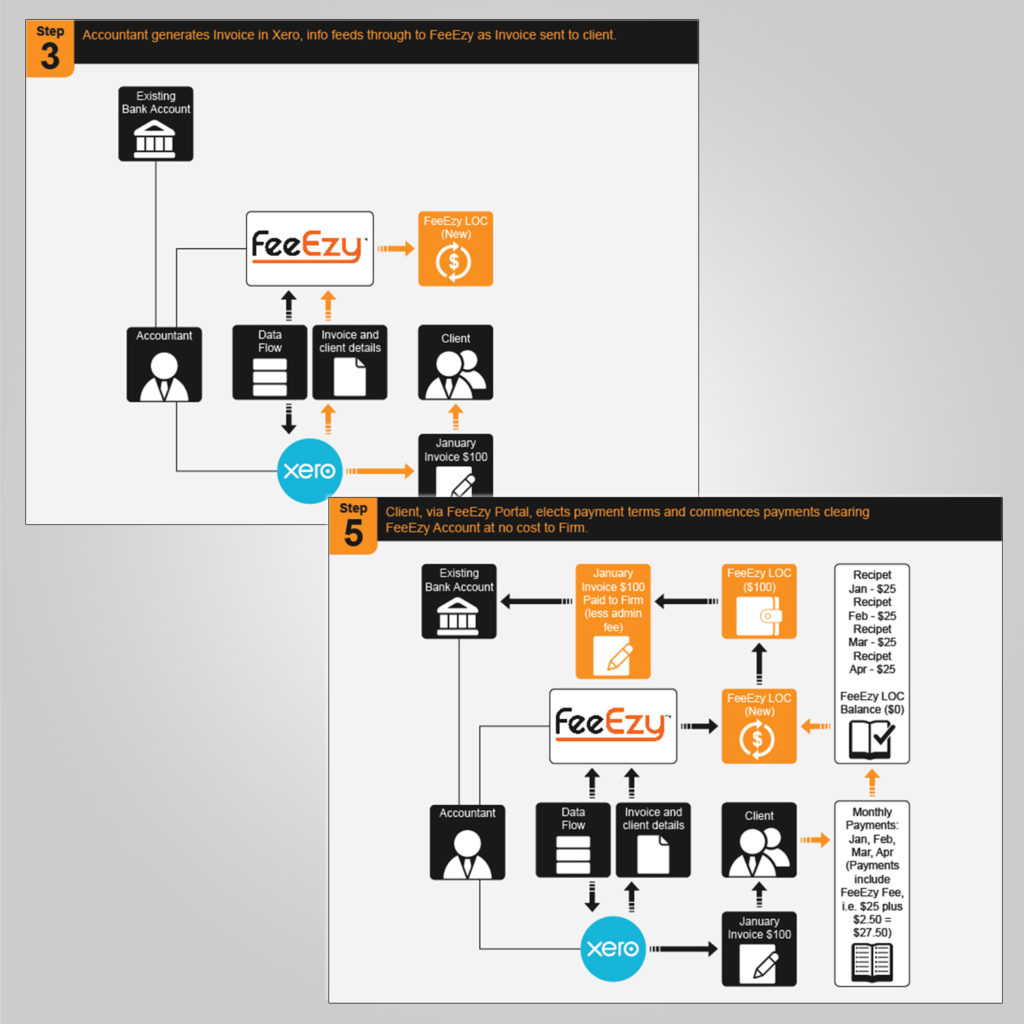
FeeEzy Infographic
FeeEzy, an online invoice funding and payments platform for accounting firms, needed an infographic to help customers understand the simplicity of their process. Using colors from their website and logo, a five-panel infographic was designed to clearly explain the transaction process.