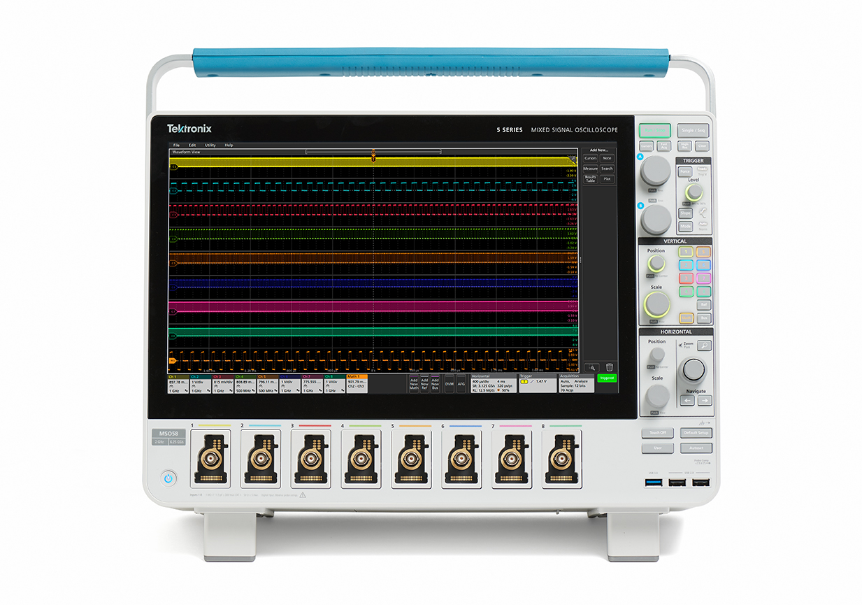
The development of the re-imagined 5 Series MSO Mixed Signal Oscilloscope brought with it the challenge of creating a user interface that seamlessly integrated the advanced features Tektronix users had come to rely upon. Designed specifically for a touch-enabled environment, the new UI leveraged intuitive gestures and behaviors, ensuring a smooth and familiar experience for users across a variety of skill levels.
By incorporating touch gestures that users would recognize from everyday devices, the interface aimed to reduce the learning curve while providing powerful tools for deep waveform analysis. The goal was to combine the high-performance capabilities of the 5 Series MSO with a modern, user-friendly design—making advanced signal measurement both accessible and efficient.
UX Testing:
Menu Transparency
Content/Control Location
User Interface Colors

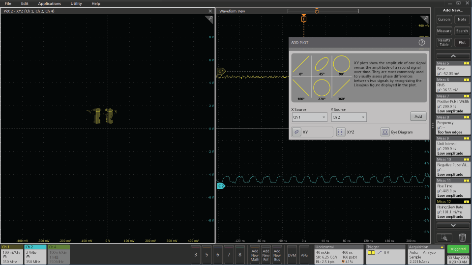
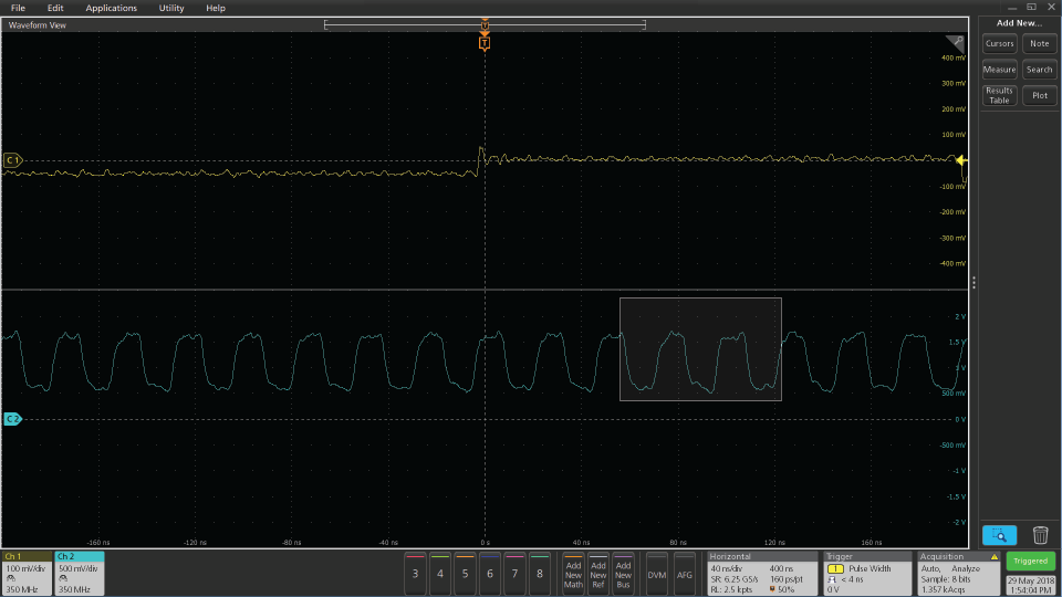
Initial menu transparency approach
Initial menu transparency approach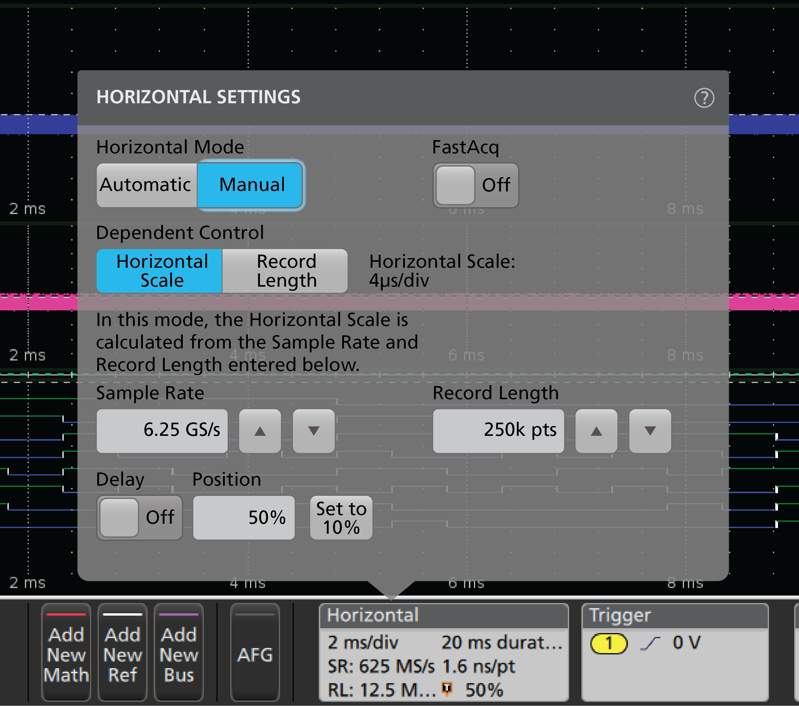
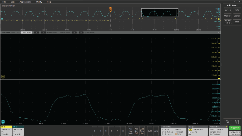
Second iteration menu transparency
Final menu transparency


Selected color scheme in product
Initial control area color scheme
First alternate control area color scheme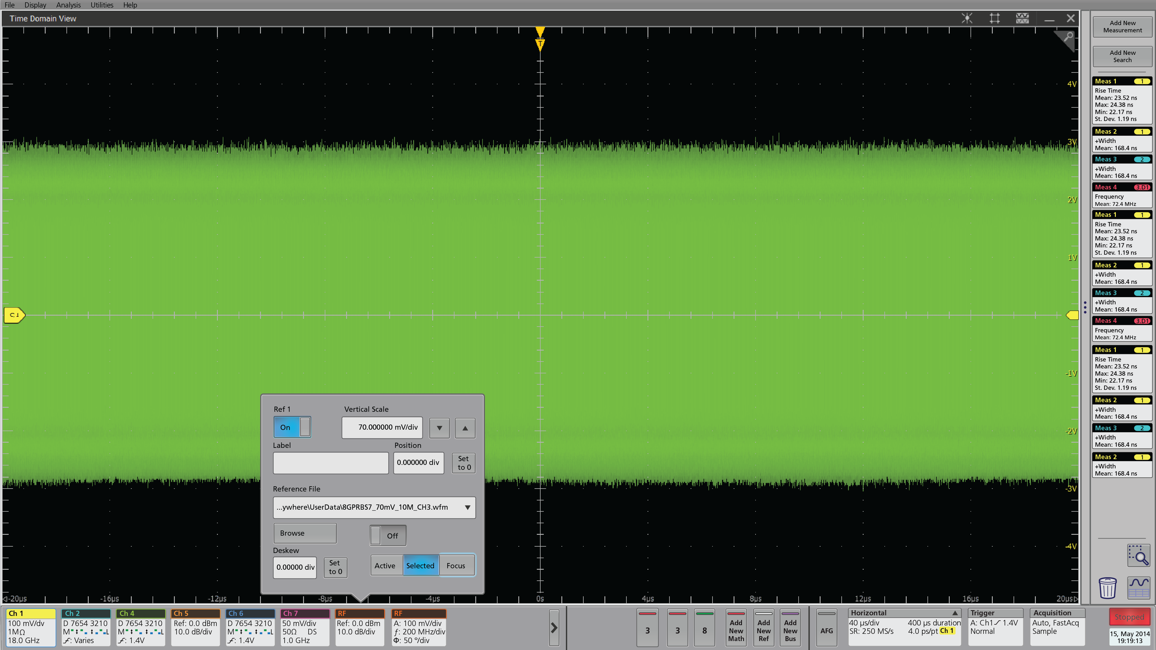
User selected control area color scheme